When chosen well, paint colours can just about achieve anything you need them too. Interior designers are experts at using colour to create zones in multi-functional spaces, highlight focal points, make rooms look bigger, create accent walls and other features. Plus, interior paint colours can instantly change the mood and energy of a room too. The trick of course, is how to select the right paint colour for a room and where to put it. Here is our checklist of considerations to help you pick the perfect colour for your renovation project.
Find a colour that you like and suits your scheme and other interiors
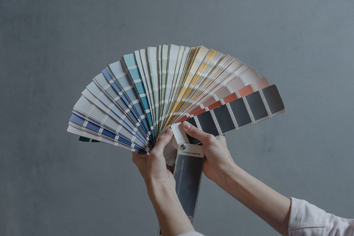
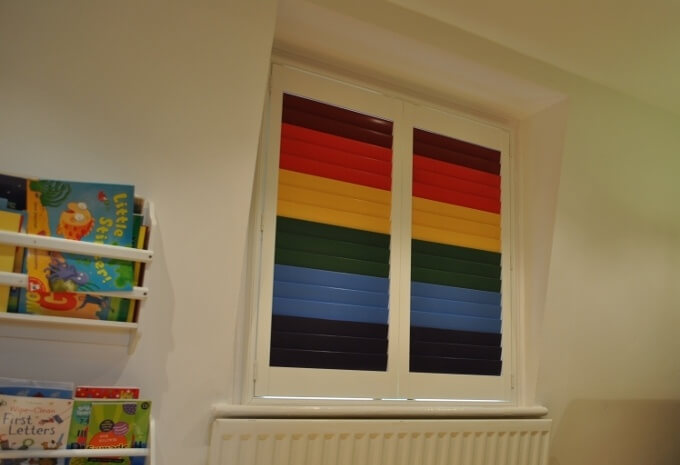
While there are hundreds of paint samples to choose from at the paint store, there are only seven colours in the paint spectrum – red, orange, yellow, green, blue, indigo and violet. Eliminate a couple of colours that are definite ‘no no’s’ before you do anything else. If you cannot bear the colour blue then no shade will persuade you to put it on the walls in your home, so strike it off the list.
If you want the room you are painting to tie in with the colour scheme used in the rest of your house then you will need to use the colours within your existing colour palette. You might choose a lighter or darker tone of a colour used in another room or choose colours that complement some of the key furnishing pieces you have in the rest of the house. You should also think about the furniture you have in the room and what colours will complement its style and colour – glossy, white contemporary cabinets will likely inspire a different colour theme to traditional mahogany or oak furniture. Similarly, if you have neutral or white coloured window shutters, you might want to show them off with a darker colour on the walls (or vice versa)
Think about how the room is used and the mood you want to create
When you choose paint, not only do you need to find a colour that you like and that suits your colour scheme and other interiors. It is also important to choose a colour that is a reflection of your personality and creates the mood and atmosphere that you wish to achieve. Yellow or orange for example, is perfect for capturing joy and happiness and is a popular choice for kitchens, dining rooms and bathrooms, where the space needs to be energising and uplifting.
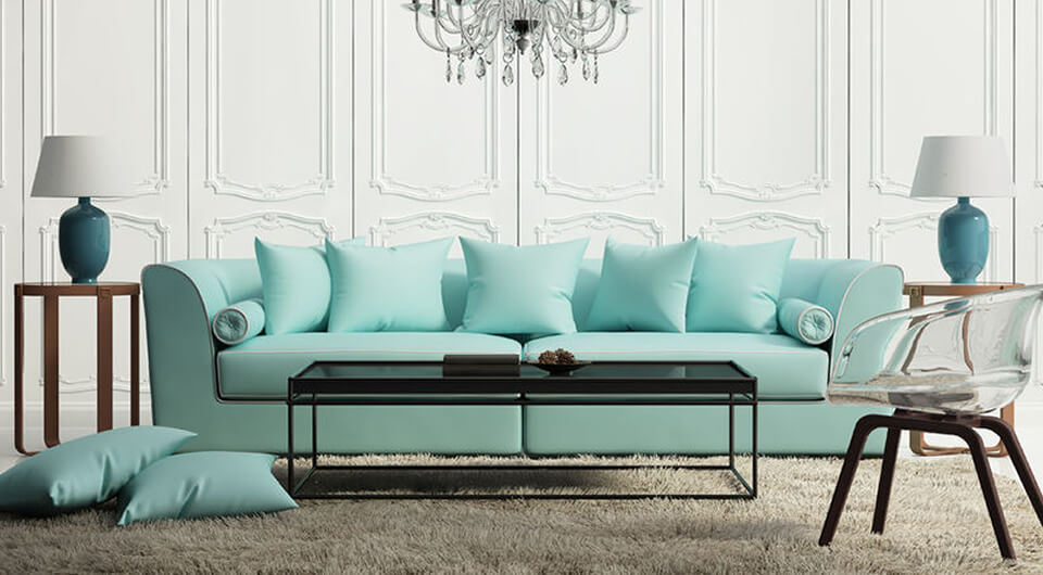
Warmer, brighter blues such as turquoise are great for encouraging relaxation in social areas such as living rooms or large kitchens. Soft blue shades are known to have a calming effect when used as the main colour of a room so would be great in a bedroom. If you want to keep the atmosphere calm and relaxing to create an anxiety busting environment throughout, then white with grey tones will work really well.
If you are painting a home office or study, choosing the right wall colours can actually help you be more productive while working. If you have a creative job for example, orange tones will serve you well. They evoke vibes of enthusiasm and energy and will give you a lift during afternoon slumps. Blue is said to stimulate the mind which would be a great choice if your work is quite repetitive, while softer blues and pastel shades will have a calming effect if you are required to really concentrate – writing for example. Earthy greens are good for promoting balance so accountants or those in financial industries might consider this. Dark green will help you feel empowered.
Using colour to create an illusion or focal point
Whether it is highlighting a feature wall or creating flow, there are lots of ways to use paint. Here are a few ideas:
Make a space feel bigger or cosier
Colour is often used to help maximise the physical space of a room. Typically, light, bright colours and neutral paint are well known to create the illusion of a bigger space, so keep your main colour simple and natural. Warmer, darker colours are used to create a sense of intimacy as they are said to give the perception that the surfaces are closer than they are.
Flow and zones
In recent years, an open plan ground floor layout has become increasingly popular and therefore, for many homeowners creating design continuity is important. Arranging your furniture in a cohesive design that flows throughout the space will help a room or open plan area to be used in the most effective way.
Paint can be used in the same way. Using the same colour/s throughout the entire open plan space will keep things flowing nicely and will help open up the space. However, if your space is multi-purpose, you may choose to use colour to ‘zone off’ areas. For example, if you have a desk in the corner of your kitchen, you may choose to paint the walls enveloping your desk in a different shade. Alternatively, separate a dining and living area by using a different paint finish.
Use colour architecturally
If you have some stand out architectural features in your room (decorative molding, an impressive built-in bookcase, an arched doorway or some beautiful panelling) you can use colour to show it off. Painting structural features just a little lighter or darker than the primary wall will draw attention to their detail. A crisp white cornice against a darker colour wall or a neutral shade above some oak panelling are the sort of subtle tricks that can really make a difference.
Feature walls
Where rooms are relatively featureless, painting an ‘accent wall’ in a bolder hue where the others are white or neutral can add a contemporary edge to a room. They also make good talking points especially when used in the living room or kitchen where people typically socialise.
Top tip
Paint never looks the same as on the paint sample card or tester pots, does it? This is often due to the changes of light in our rooms. The colour can look different in the bright light of day to what it does in the evening when the sun disappears. Some parts of your wall will likely be in shadow during the day and other parts exposed to sun. We would always recommend buying some sample pots and testing them on different walls, in different lights, and viewing them at different times of the day before you commit to buying large pots of paint and applying it to large areas.
How much paint will I need?
Our wall painting calculator will help you to work out the minimum amount of paint required for your project, based on a coverage of 10m² per litre of paint. Enter the dimensions of your walls and then enter the dimensions of any areas you don’t want to paint (i.e. windows, skirting boards). Enter the number of doors in your room then decide on how many coats of paint you want.
When it comes to painting walls there is plenty to think about. As you have seen, it’s not just as simple as picking your favourite colour! If you are undertaking some DIY in the near future, we hope this makes the job of picking paint colours a little easier!
