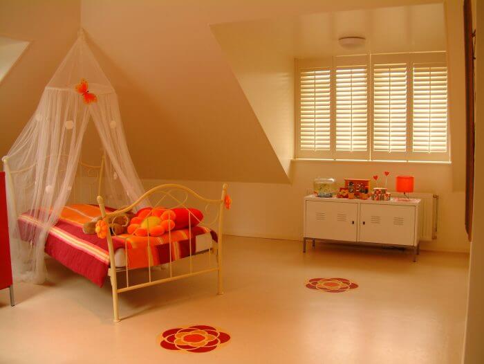
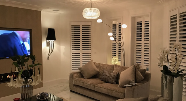
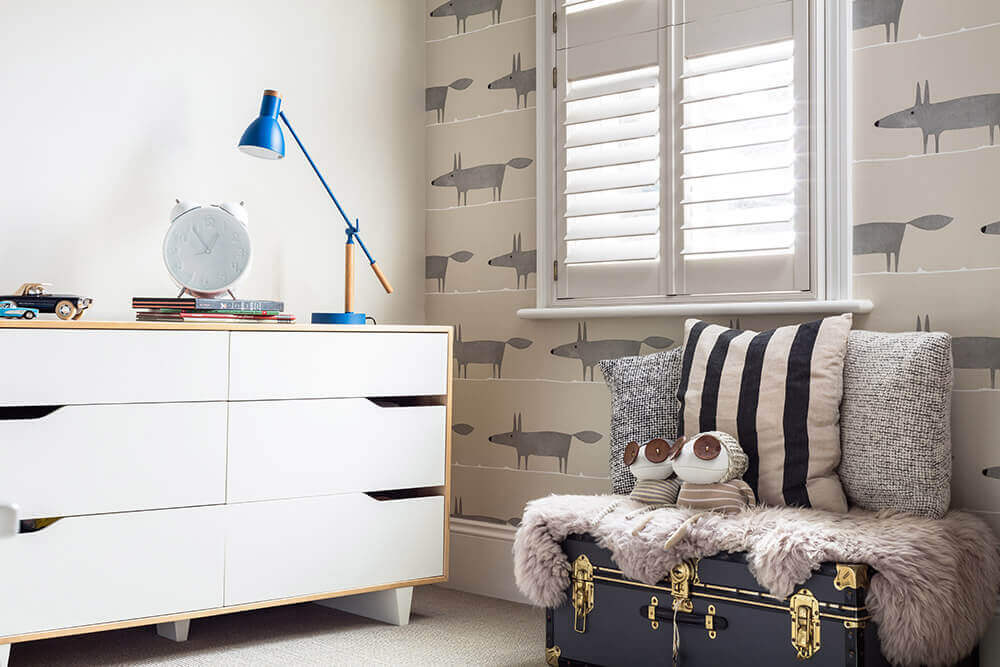
We see so many amazing interiors when we visit client’s homes, every shutter installation we carry out is individual to the rooms and homes that we see. An important factor in the shutter design is the customers own taste and preferences, as well as the look and feel of the room they are to be installed. One of the main things you first notice when you walk into a room is the colour that it has been painted. All our shutters can be custom coloured to match or work with certain aspects of the room and the colour the room is painted plays a vital role in the final design of the shutters!
Did you know that colour accounts for roughly 60% of our response to a place or object and creates a subtle yet significant psychological reaction to what you are viewing. The colour which we paint certain rooms of our home is often rather overlooked and the effect it can have on us underestimated. Getting paint colours correct can really have an impact on the way you feel in your own home, which is important as you spend the majority of your life there!
So what goes into picking the right colour paint for your rooms?
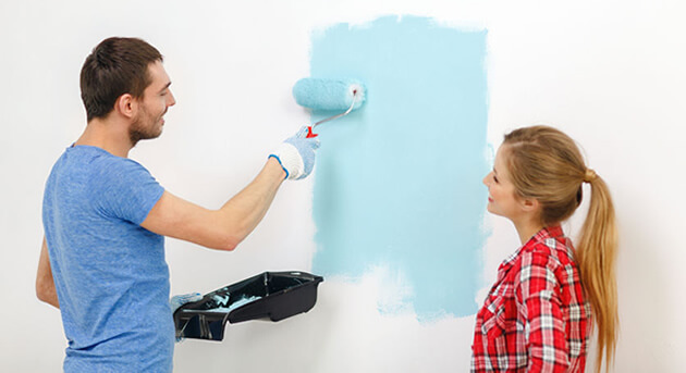
For those not sure where to begin with picking colours know that the selection of colours out there is limitless so experiment as much as you can. Discuss the options with those that you live with and visit DIY stores to get an idea of the colours and finishes available. Selecting colours for your home can actually be really exciting and a way to make the home your own, as well as creating something that impresses family and visitors when they pop over. You can take inspiration from things in your daily life that you enjoy or like looking at as well as items and features that are already within your home.
The lighting of a room
Paint can look different depending on the lighting of a room, so it is important to get a feel of how the actual colour will look on different walls or parts of the room. It may also be that you need to change the choice of colour or shade, because of the lighting or lack of in a certain room. This is another reason why we work with you to pick the perfect style of shutters to bring the correct levels of natural light into each room. Natural light shows off the truest of paint colour. Incandescent lights bring out warm and yellow tones and fluorescent such as those in kitchens and bathrooms often create a sharper bright blue tone. With most lights and bulbs you can purchase certain colour temperatures to work with your new paint work and room. The majority of standard lights are a standard level of warm or cool white, but it is important to research the exact level you need to work best with your paint and mood of the room.
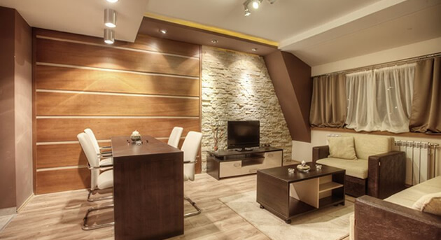
Creating a mood for each room
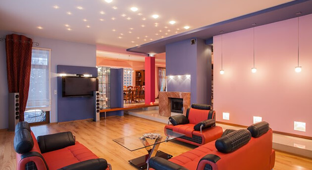
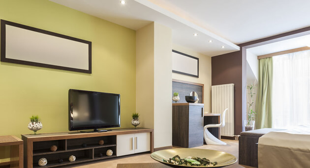
As strange as it might sound, you will have different moods and feelings in each room, or be trying to create a certain mood within them. From the living room to the bathroom, each area of the home should suit or invoke a certain type of mood. In your bedroom for example you may want to create a warm, cosy and restful mood using soft and neutral colours but other rooms may be slightly more difficult to pinpoint the mood. How would you set the mood in a room such as a dining room? Are you looking for a sociable and exciting room for parties and guests or do you envision more of a quiet and formal atmosphere for just you and your family to enjoy? The paint you pick will help create the desired mood.
Use a colour wheel and swatches
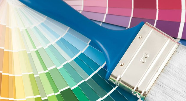
A colour wheel is a great little tool for matching and intensifying colours and creating the right feel for a room. By using the colour wheel you can work out whether colours are toning, harmonious or complementary. The colour wheel is made up of Primary colours which are the Red, Blue and Yellow. Secondary colours which is what’s created if you mix equal amounts of the primary colours, for example Red + Yellow = Orange and Tertiary colours which are what is created if you mix a primary with a secondary colour at a ratio of 2:1. Looking at the colour wheel drawing an imaginary line down from the yellow-green area to the red-violet you can see that the left hand side is made up of warm/hot colours and the right side are cool/cold colours. Neutral colours are not found on the colour wheel and are made up of White, Black, Grey and often Beiges and Brown. They all go together and can be mixed and matched without dominating over another. Once you have decided on the types of colours you want to work with in your room, you should decide on the exact tones and shades of colours by looking at the many swatches that are available when looking in paint shops.
Using monochromatic paint schemes
A monochromatic colour scheme is created by taking any one of the twelve hues from a basic colour wheel and repeating it in different tones, shades and tints. If you find that using just one colour has created a rather boring look then it can be worth using variations of the colour group to create contrast on different walls, trim and furniture. You can use a bold colour to make an area stand out or simply more subtle colours which blend with each other. For accent colours you can select cooler colours or warmer colours which will compliments the main colour of the room. When it comes to trim around the room white or off white can be used as a striking accent against monochromatic colour groups.
Testing out your colour choices
When you have picked the types of colours you consider will create the perfect mood and feel in your room, get home and test them out! It is one thing looking at swatches in a shop, but can be a whole different story at home in your own rooms once up on the walls. We recommend painting onto boards and placing them around certain areas of the room to get a feel for how the paint will look in different parts of the room with certain lighting. Painting directly onto the wall can become a bit troublesome when trying to paint the final colour over it which is why we suggest the board. Sometimes the colour can look very different to the swatch or colour on the tin once it has been placed in your room, so we suggest trying out as many shades and variants of your colour scheme using testers pots so that you can be 100% sure of your choice before purchasing all the paint and painting the whole room.
Get in touch!

